
Icons
The GEZE icons present information and interactions in a simple, direct way. They are an essential element of the corporate design and can be used flexibly. The complete icon sets can be downloaded here.
Style
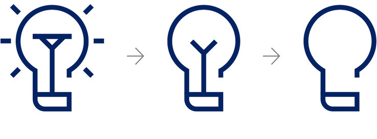
The subject of opening is communicated in the stylistics of the icons. Their linear, angular design language supports the technical character.

Design
Care must be taken to present the information as simply as possible and to reduce the design to a minimum.

Size
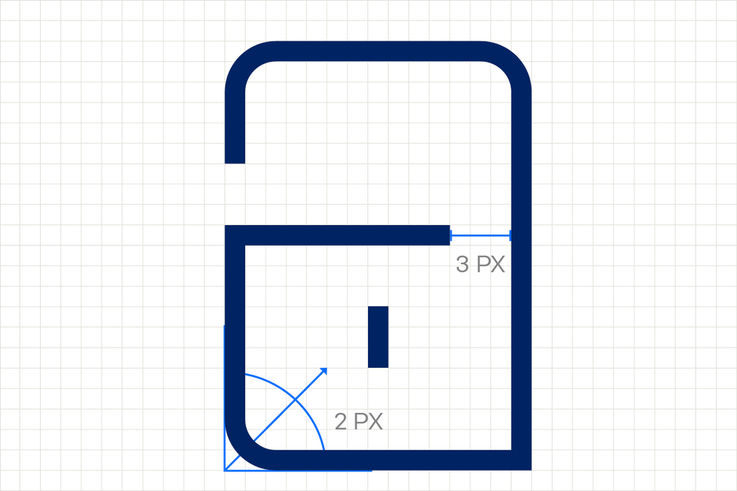
All icons are designed precisely as 24 x 24 pixels.
Composition
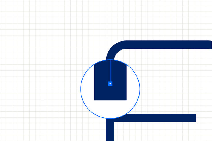
In design, an angular design is always preferred to a round shape. The lower left corner is rounded to 2 pixels and the icon is 3 pixels open to the right. If this is not possible, an opening at another point of the icon should be integrated.
Line width
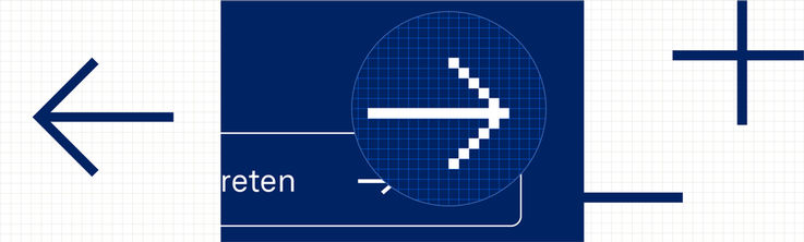
Icons always consist of contours without fill. The line width is 1 pixel.
Colour scheme

Functional application
In functional applications, icons are displayed exclusively in GEZE blue and white.

Illustrative use
In illustrations with a purely design function, icons may also be depicted in Accent blue and GEZE yellow.

Brand recognition in the icons
If an icon needs to independently reflect the GEZE brand (see brand recognition in the typography), elements can be coloured in GEZE yellow.
System icons
Functional icons are defined for digital applications. They enable clear and uniform user guidance and are presented as simply as possible.
The structure of the system icons is not necessarily defined according to the previously defined style. The focus here is on reduction.
Icons and typography
If icons are directly related to typography, some combination rules must be observed. This does not exclude editorial use in free layout design.
Use of typography
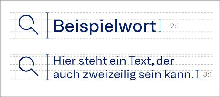
Icons are set in a ratio of 3:1 or 2:1 to typography. The principles defined in the area of typography apply here.
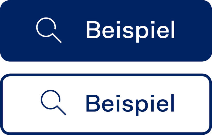
If the icon is directly combined with the typography, the colour of the two elements must match.
Distance
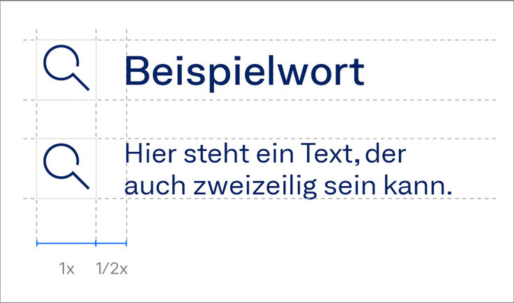
The distance between text and icons or between icon and icon is always half the height or width of the icon.
Positioning
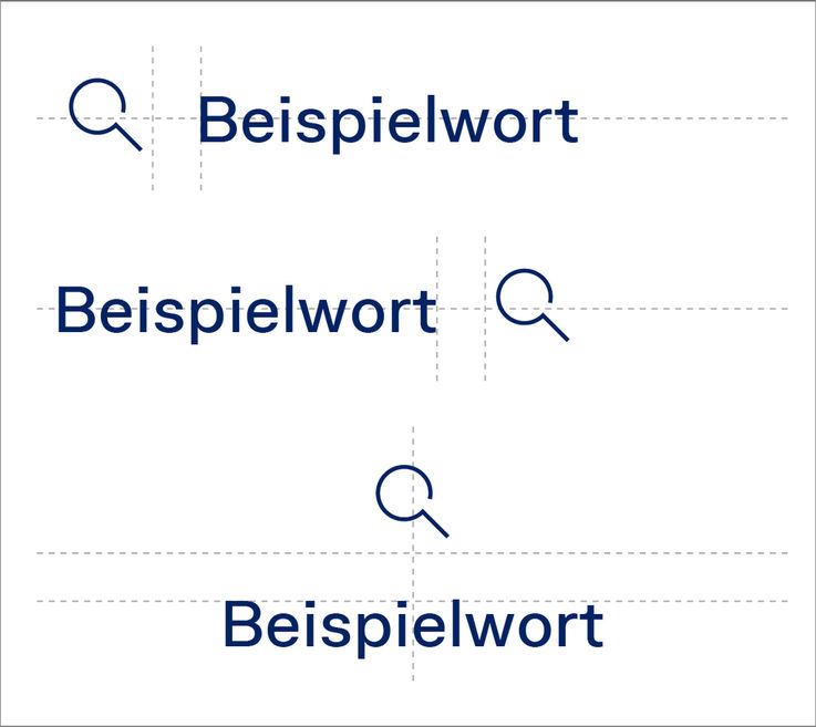
Icons are positioned either left, right or centred above the typography.
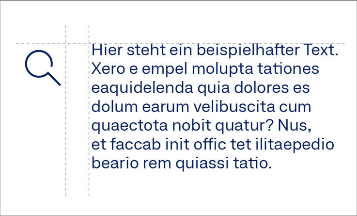
When there are 3 lines or more, the icon is flush with the upper edge of the text frame.