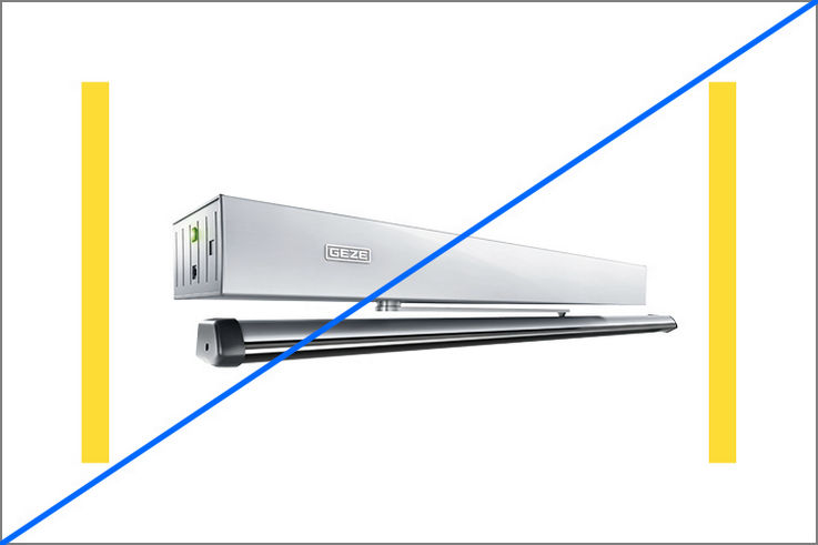
Frames and text
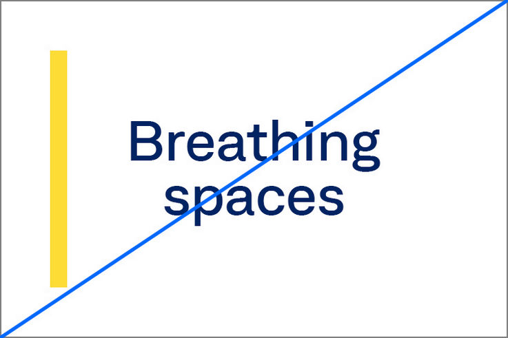
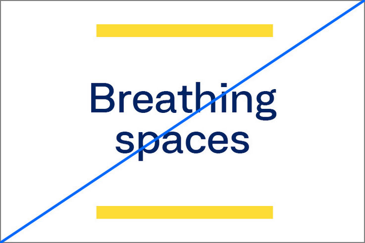
Frames highlight important messages and headlines. Notes, quotations or important text sections can be emphasised by using frames. Frames can also be used to structure content and separate sections from each other.
Emphasis on headlines
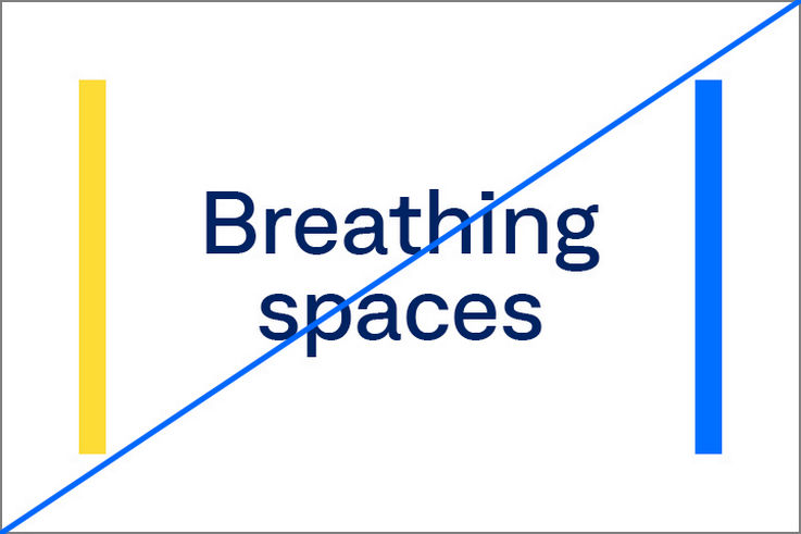
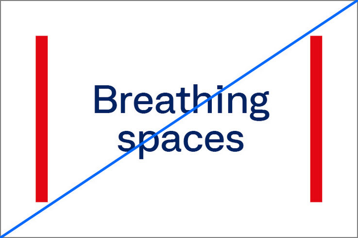
Frames highlight important headlines. These can be combined with an image or can stand alone. The colour of the frames at headline level is always GEZE Yellow. Not every headline has to be placed in frames. Do not make excessive use of frames. They should be used to highlight key messages.

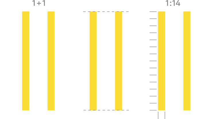
Size and proportion
Two vertical bars form the frames. They are always flush with each other. The height and width of the frames are fixed in the ratio of 1:14.
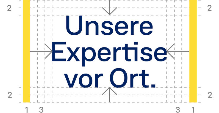
Spacings
The frames can contain headlines ranging from one word up to three lines. When using text in frames, a minimum distance to all edges must be maintained: two frame widths to the top and bottom, and three frame widths to the sides.
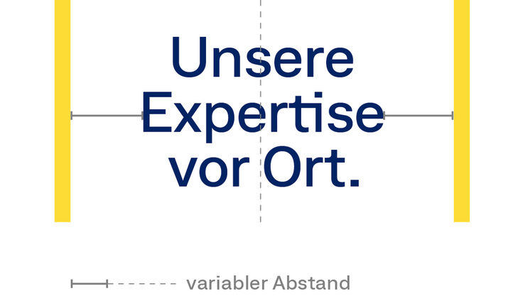
The space between the frames can be extended as needed. Nevertheless, short concise headlines are preferable. In addition, when the text is right or left-justified, it should always refer to a frame.

Font size
The font size can be flexibly adjusted within these distances. The font size must be at least 2 bars high.

Positioning
If there is only font in the frames, it is centred.

If an image is included, the text is left or right-justified.
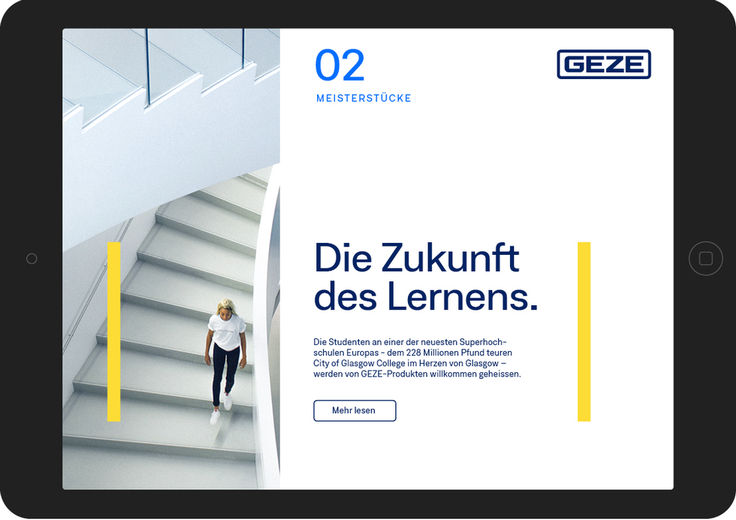
It is particularly important to maintain the same frame size in related media types. Extended frames should be avoided: the space between the two frames should be widened instead.
Emphasis of paragraph text
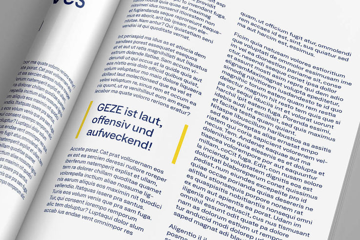
Frames can be used in paragraph text for structuring, marking and highlighting. Frames used to emphasise paragraph text are exclusively in GEZE yellow.
Alignment
Texts can be aligned centrally or left or right-justified.
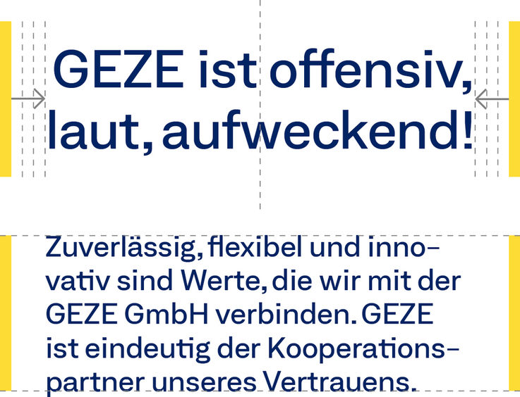
The following exception applies to the headline: The text can, but does not have to, be flush with the frames at the top and bottom.
Delimit and structure content

Content can be structured with both the lines and the frames. When combining the elements, ensure that frames are used only where the content is to be clearly delimited. To structure content, frames in Yellow and Accent Blue can be used in pairs or individually.
