Image style
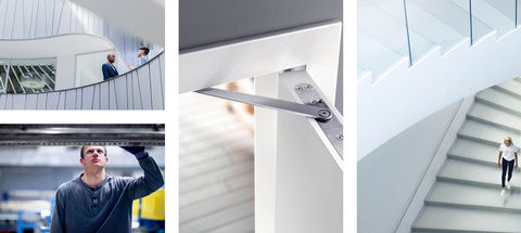
The following elements form the cornerstones of GEZE imagery. Consistently adhering to these ensures a uniform look and feel to our images.
Colour scheme
Natural colour temperature
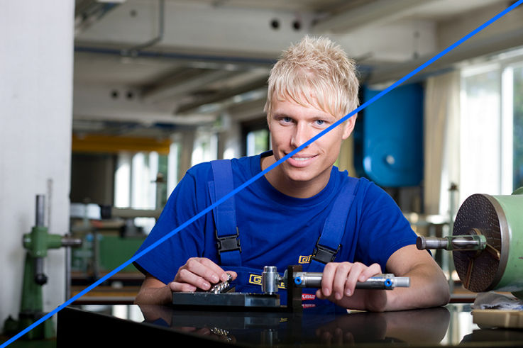
The colours are always natural and reflect real lighting conditions. Pictures are slightly desaturated, but should not appear cool and colourless. The colour temperature is slightly bluish and is not too warm (yellowish, reddish).
The images always look stylish and high quality, are never saturated or too colourful. Coloured accents in the corporate colours, but also other colours bring vibrancy and set a clear focus.

Colour accents (corporate colours)
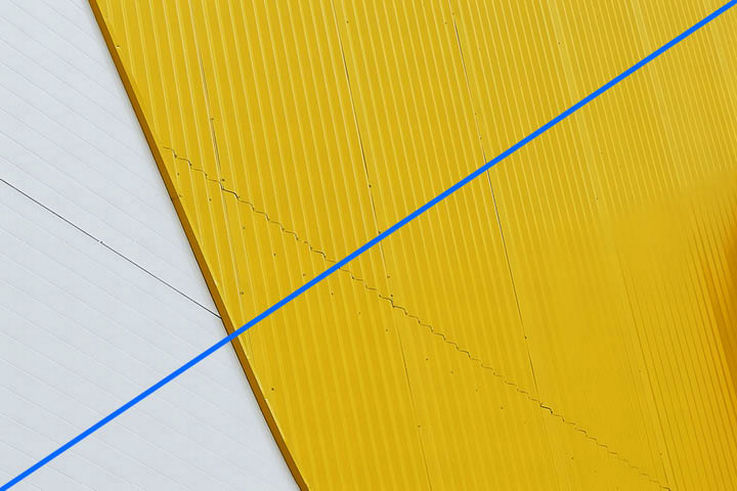
Colour accents in the corporate colours blue and yellow can be used as stylistic elements to give the motifs a brand-defining look. It is important to ensure that the motifs are not too colourful overall and that they are reduced in colour next to the colour accents.

Image processing
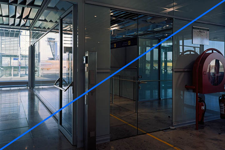
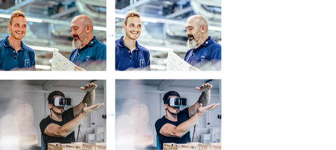
During image processing, imagery is adapted to the GEZE colour scheme. The colour temperature is slightly shifted to bluish, although people should not appear ill or unhealthy! Bright or dark areas are also intensified to give images the necessary depth.
Perspectives
Think differently. Shoot differently.
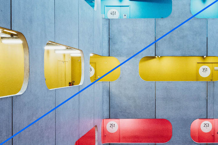
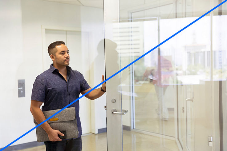
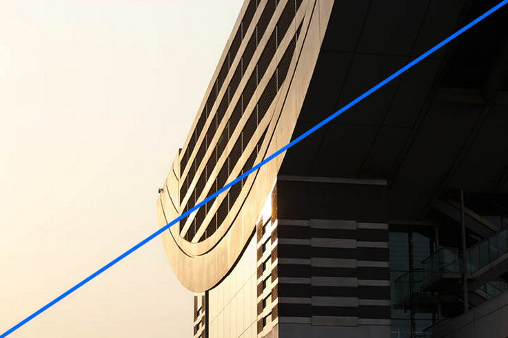
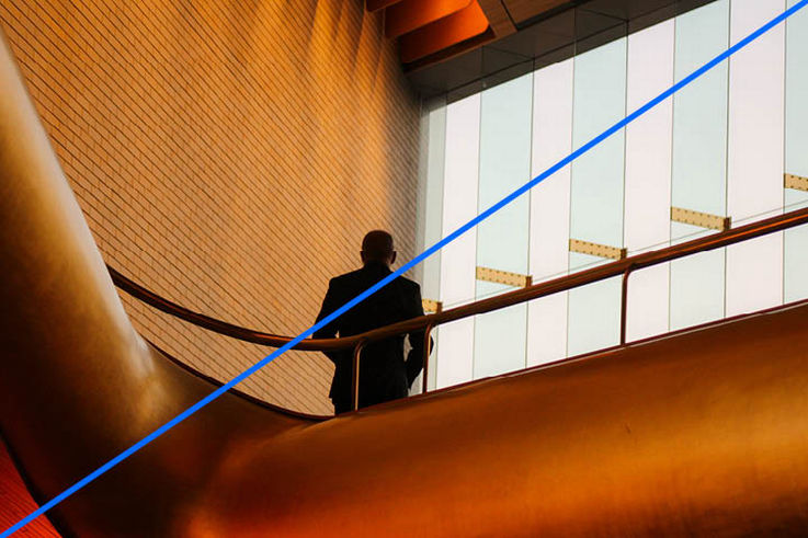
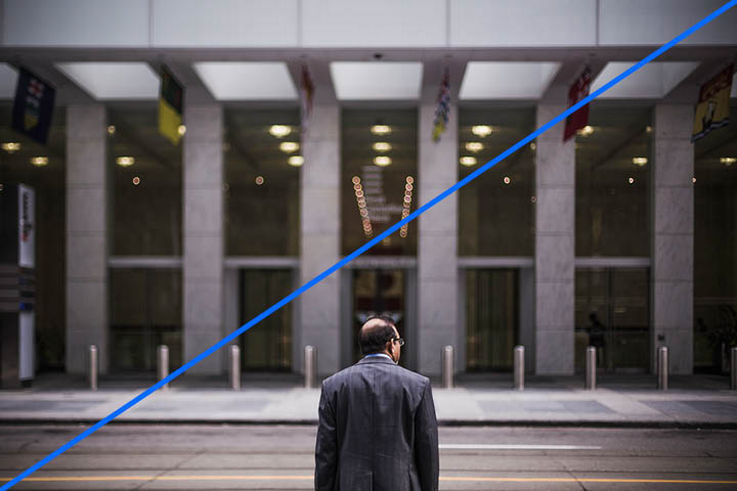
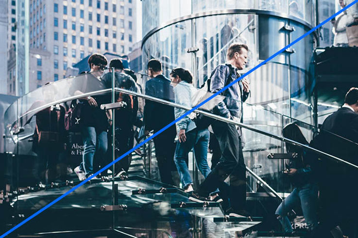
Exciting and unusual perspectives add movement and strength and depict GEZE as a dynamic company. To give the viewer the sense of being right in the midst of the action, motifs can be photographed, for example, through open doors, past pieces of furniture, or following the course of a staircase. The perspectives look spontaneous, and should not be too extreme or distorted. Bold and decisive crops emphasise the brand value ‘agile’.

Light
Show liveliness. Live openness.
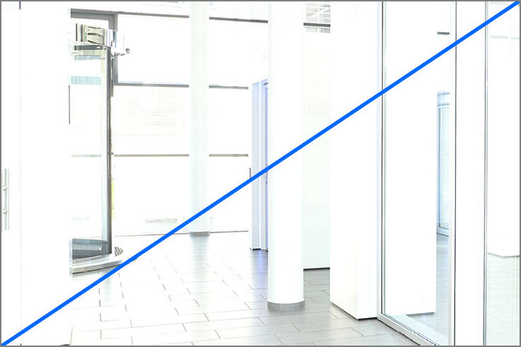
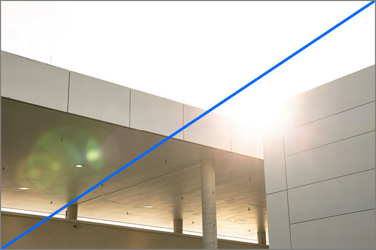
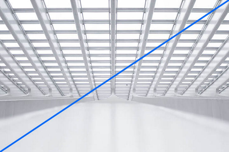
The interplay of light and shade is characteristic of the visual style. Whether indoors or outdoors, the natural lighting conditions (depending on the situation and location) set the tone. Sunlight entering through windows and doors brings subjects to life and can be used as a stylistic device. The images have strong contrasts, appear powerful and usually have bright areas blending into whitish. Very bright, overexposed images as well as artificially used backlighting and lens flares should be avoided.

Sharpness/blurring
Emphasise mobility. Enforce naturalness.
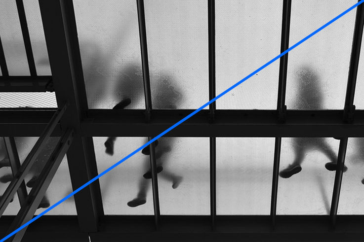
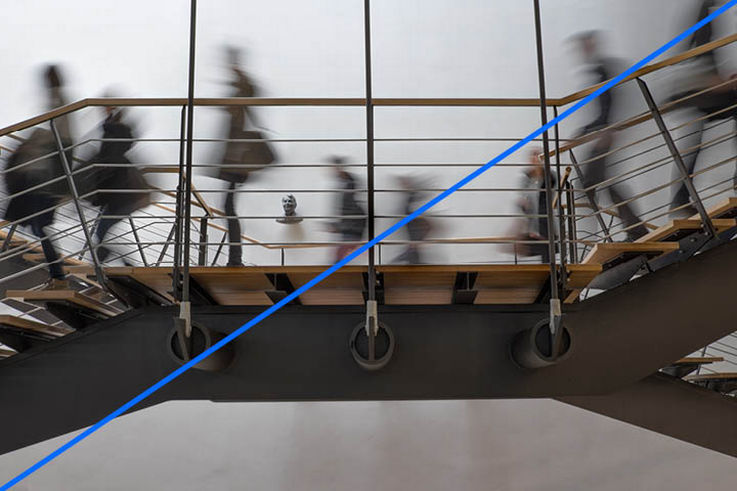
Blurring can be used as a stylistic device, but does not have to appear in every motif. Images are pure and have a clear focus. Extreme and diffuse motion blur and insufficient depth of field should be avoided so that the natural character of the image is not lost.

Image composition
Set the focus. Avoid complexity.
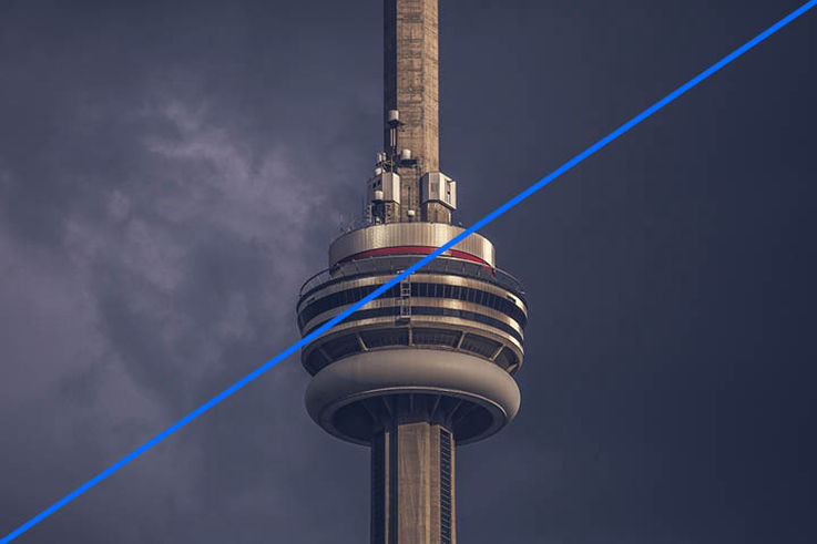
GEZE images should never be over busy, and must have a clear focus. The composition of the image is reduced with clear lines and builds up tension, but also offers quiet zones to direct the viewer's gaze to the image’s key message. Complicated composition and busy backgrounds should be avoided.
