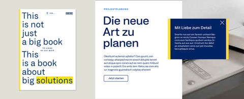
Colours
The GEZE colours are GEZE blue, GEZE yellow, Accent blue, sand grey and white. GEZE blue and the complementary colour white are the leading colours. They define the image. Accent blue, yellow and sand grey are used for emphasis only when highlights are needed. The defined colours can be downloaded here:
Primary colours
All primary colours are used as full-tone colours. Disassociation (rasterised, darkened, transparent) should be prevented.

GEZE blue
Special colour: Pantone 281
CMYK: 100/70/0/40
RGB: 0/35/100
RAL: 5013
ORACAL: 050 dark blue
HEX: #002364

GEZE yellow
Special colour: Pantone yellow
CMYK: 0/6/100/0
RGB: 253/220/53
RAL: 1018
ORACAL: 022 shell yellow
HEX: #fddc35

White
Special colour: white
CMYK: 0/0/0/0
RGB: 255/255/255
RAL: 9016
ORACAL: 010 white

Accent blue
Special colour: Pantone 285
CMYK: 86/32/0/0
RGB: 0/110/255
RAL: 5015
ORACAL: 052 azure blue
HEX: #006ee1

Sand grey
Special colour: Pantone Cool Gray 2
CMYK: 3/0/5/12
RGB: 224/225/218
RAL: 9018
ORACAL: 072 light grey
HEX: #e0e1da
Secondary colours
Secondary colours are defined to support the colour palette. They are used when the primary colours are not sufficient to depict complex content.

Sand grey light
RGB: 245/247/245
CMYK: 5/2/8/0
HEX:#f5f7f5

Sand grey dark
RGB: 193/196/193
CMYK: 3/0/5/30
HEX: #c1c4c1

Secondary colour 1
RGB: 157/160/158
CMYK: 3/0/5/48
HEX:#9da09e

Secondary colour 2
RGB: 118/120/120
CMYK: 3/0/5/66
HEX: #767878

Secondary colour 3
RGB: 76/77/77
CMYK: 3/0/5/84
HEX: #4c4d4d
Positioning of the colours within the brand
To reinforce the brand's distinctiveness, it is important to define the use and, above all, the weighting of primary colours across all media. They are therefore listed individually below.
GEZE blue – Integrity and trust
The colour that defines the brand is GEZE blue. It is used as a contrast to white and represents brand quality and integrity. Where possible, GEZE blue replaces all black elements - including in typography.

GEZE yellow – Highlight and warmth
Like GEZE blue, a yellow tone continues to be part of the image. GEZE yellow is used selectively with its signal and long-distance effect as accentuation or invitation.
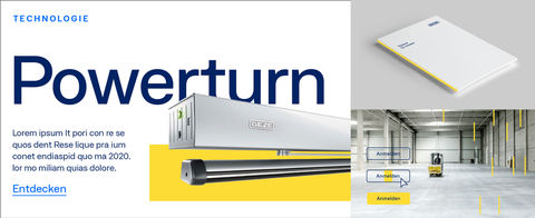
Accent blue – Accentuation and differentiation
The GEZE blue and GEZE yellow colour scheme has been extended to include Accent blue in favour of higher differentiation options. The bright blue tone is used to capture content quickly. This colour is predominantly used with discretion. More strikingly, Accent blue may appear wherever brand content is presented at a second level and the brand has already been recognised via the GEZE yellow and GEZE blue. Examples of this are: Inside pages of brochures, postcards, magazine.
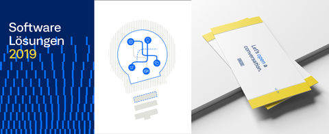
Sand grey – Structure and illustration
A warm grey tone is used for additional structuring of content. In contrast to Accent blue, the sand grey is used more over larger areas, mainly in illustrations, to distinguish between areas and as a background.

White – High quality
White plays an important role in the overall brand image and is used to ensure high quality and achieve a high-contrast colour effect. White space should be used generously in design, and included across all media (photography, trade fair construction, graphics, ...).
