Typography
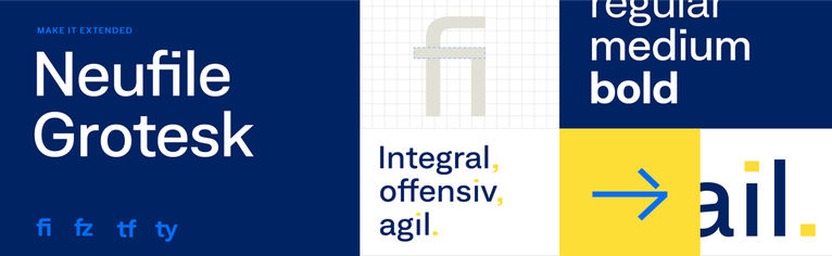
GEZE’s visual appearance is characterised by the striking use of the Neufile Grotesk Extended brand typeface in particular. We communicate with this font in all relevant media. To obtain font licenses, please contact the Marketing Department:
Characteristics of the Corporate Font
Brand recognition in the typeface
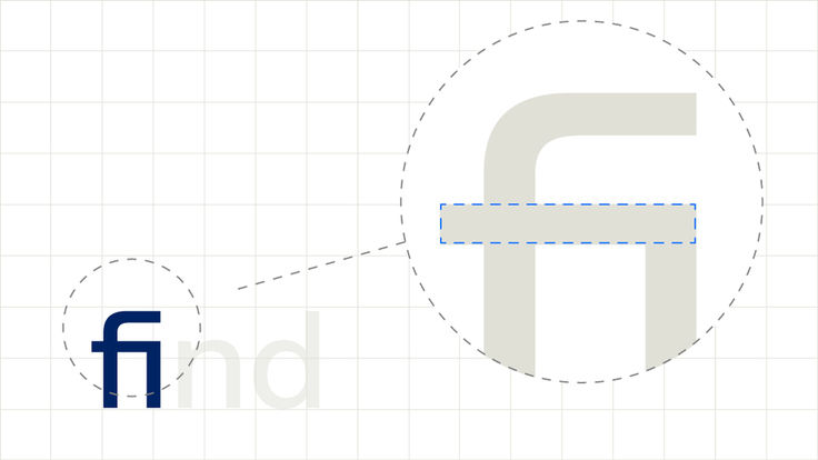
Typographic ligatures serve as identification marks for media and offer little scope for freedom of design.
Brand elements in the typeface
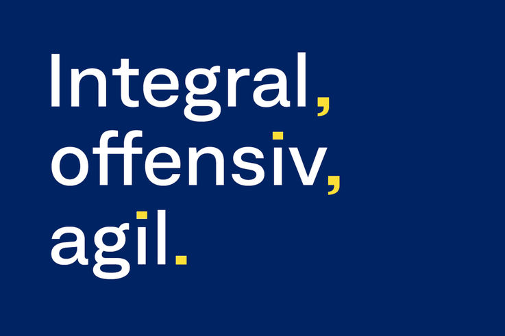
In addition, full stops can appear in colour in headlines.
Line spacing
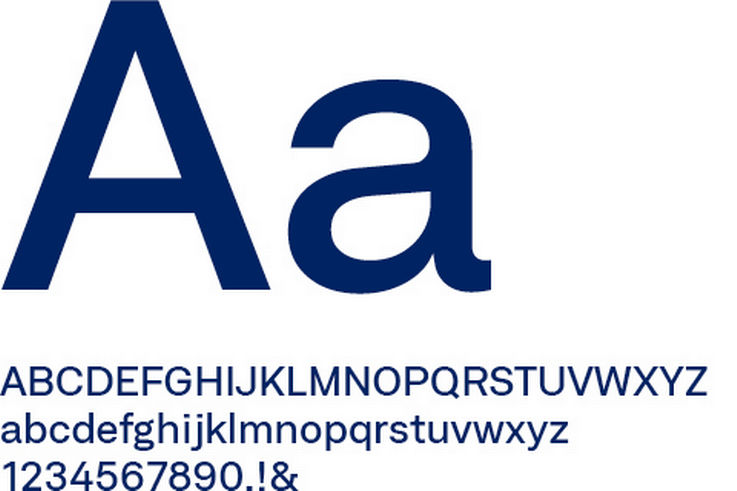
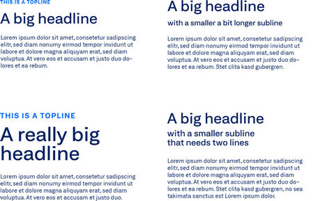
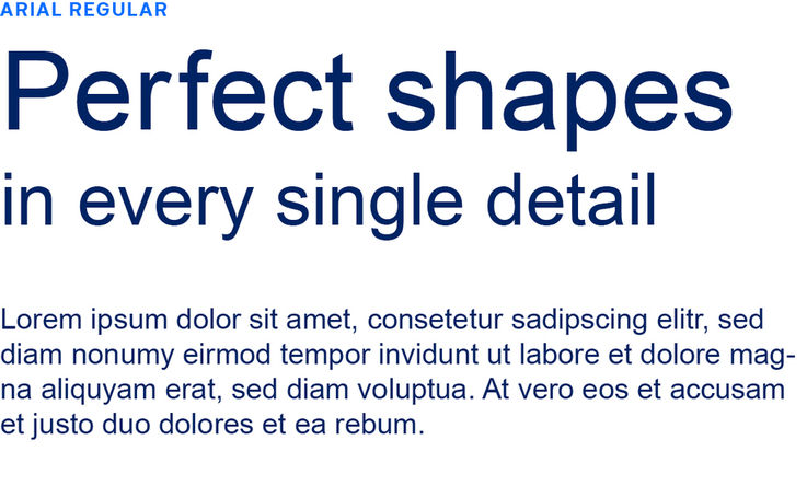
Medium Extended for headlines
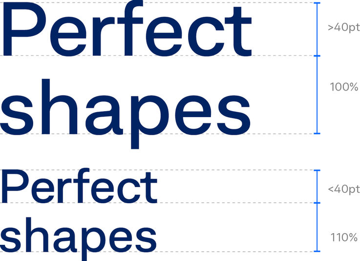
The brand identity’s most distinctive font is Medium Extended. It is used in all headlines. The new corporate design uses large headlines, so narrow line spacing should be used. The recommended line spacing is 100 % for headlines larger than 40 pixels and 110 % for smaller headlines.
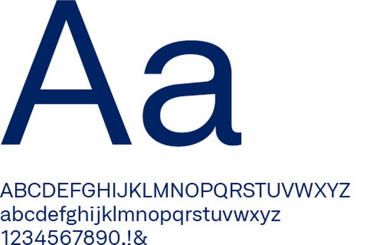
Font styles for paragraph text
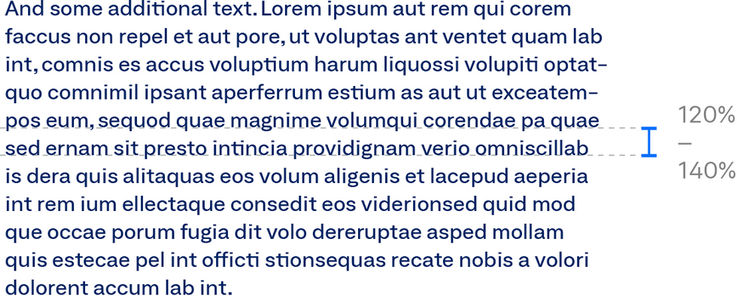
Paragraph text is always in the Neufile Grotesk Regular Extended font. You are free to choose the font sizes, line spacing and spacing of the paragraph text. As orientation, spacing between 120 % and 140 % can be used.

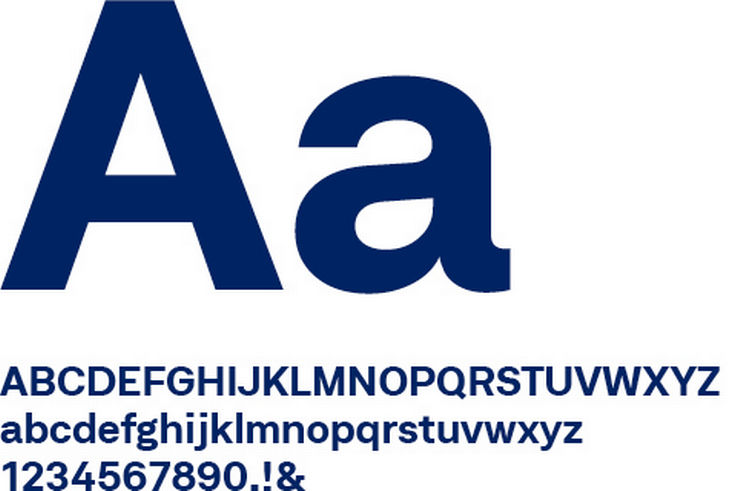
Bold Extended for toplines
The topline is set in capitals in the Neufile Grotesk Bold Extended font and letter-spacing is limited to the value 100. It always appears in the colour Accent Blue.
Text hierarchies
At different text levels, it is especially important to make a clear differentiation visible for the reader. Headlines are always set in the Neufile Grotesk Medium Extended font. The Neufile Grotesk Regular Extended font is used for the paragraph text. The topline is set in the Neufile Grotesk Bold Extended font.
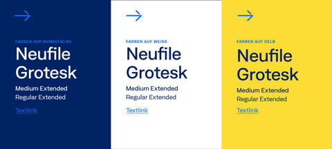
Colour combinations
The font colour combinations are as agile as the GEZE brand appearance. The typeface can be set in GEZE Blue or White. Headlines and information texts may also appear in Accent Blue and GEZE Yellow. Black typography should be used only in exceptional circumstances.
In principle, however, legibility must be guaranteed. For example, yellow typography on white is permitted only in extremely large font sizes.
Unsupported languages
Romanian, Baltic as well as Western and Central European languages are integrated into the corporate font. Substitute fonts are defined for all other languages.
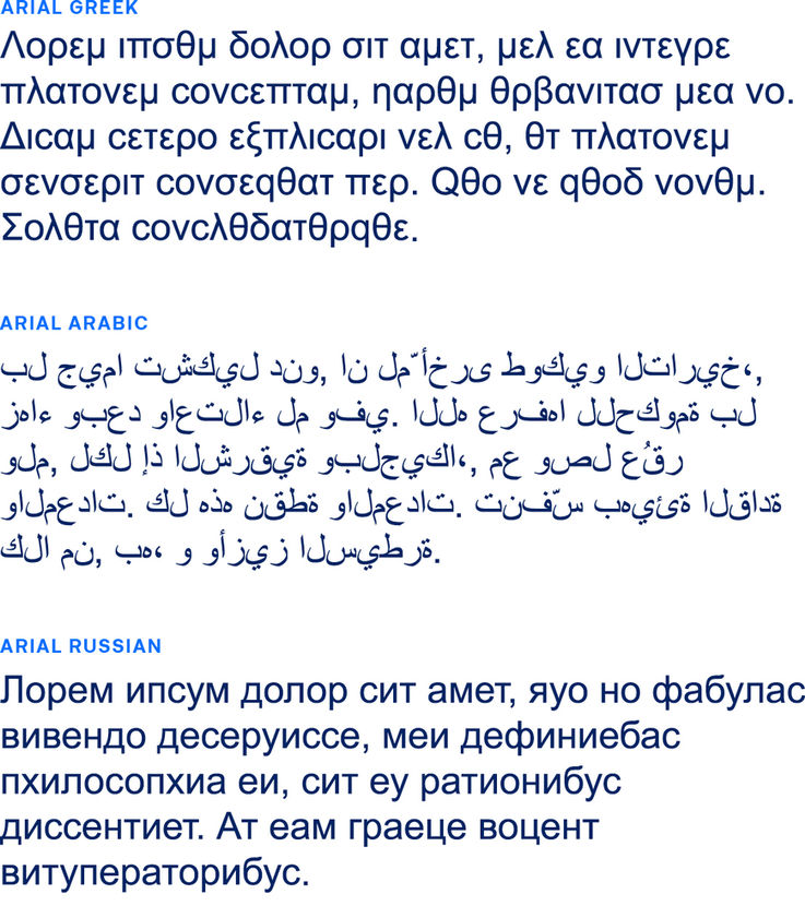
Alphabet fonts
For letter-based writing systems that are not covered by Neufile Grotesk Extended, the Arial Unicode font is used. This includes, for example, the Greek, Arabic and Cyrillic alphabet.
Alternative font for PPT/Word
For Office applications, the system font Arial Unicode is also used in the regular cut.
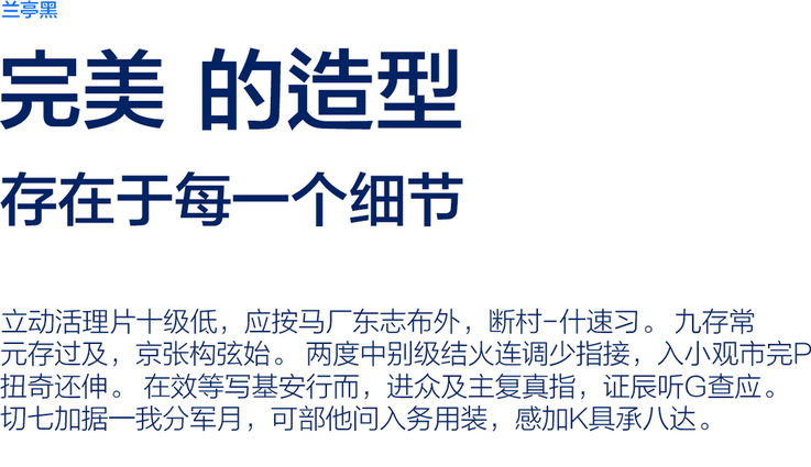
Logographic writing systems
Arial Unicode font is also used for Chinese and Japanese media.
The NanumBarunGothic font is used for Korean translations.
For Hindi, the font style Noto Sans for Hindi is used in documents, for web we also use Arial.