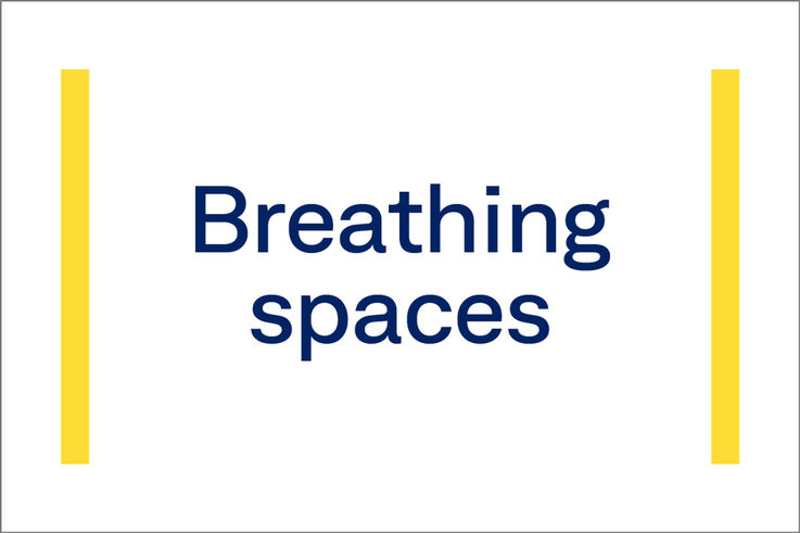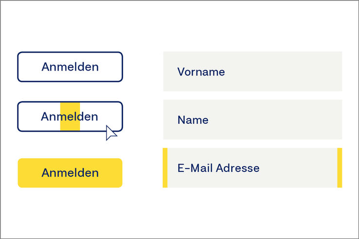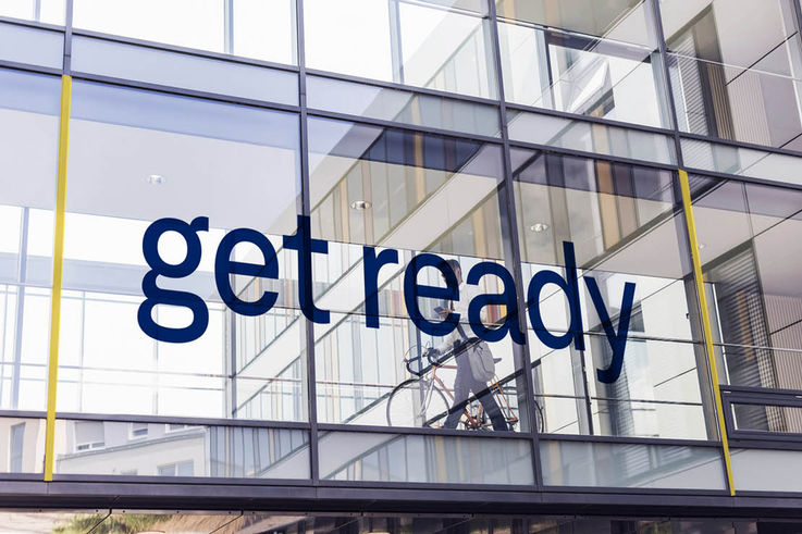
Design principles
The GEZE design principles also follow the communication brand values of ‘agile, integral, offensive’ at a visual level. The result is a consistent overall appearance.

Offensiveness in the colour scheme
Surfaces are characterised by intensive colours and maximum contrast. Transparencies that reduce the clarity of the overall picture should not be used.

Arouse and animate.
Address and activate.
In addition to the superimposed area design, the striking, offensive and extensive use of the corporate Neufile Grotesk Extended font is characteristic of the design principle.
Layout principle
The principle of always going one step further is reflected in the layout guidelines. The GEZE layout guidelines are divided into two levels of importance:
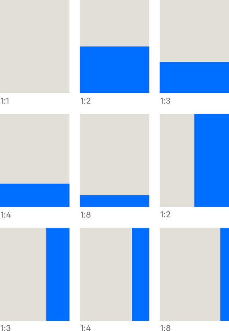
The background structures the areas.
Vertical and horizontal relations that meet flush divide the background. The division is always straight and rectangular, with maximum bleed. Each area fulfils one function.
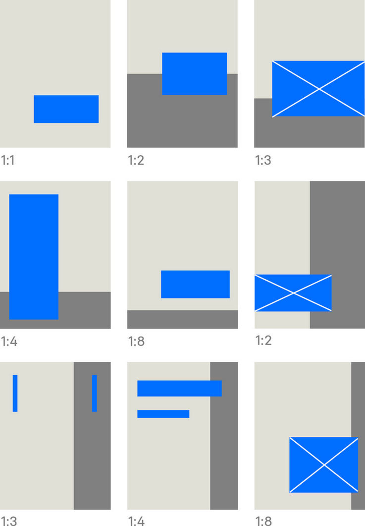
Elements in the foreground break the boundaries.
Elements such as typography, frames, boxes and images (shown here in blue) protrude in the foreground beyond their actual area affiliation. While images may be set to bleed off the edge, all other elements are detached from the edge.
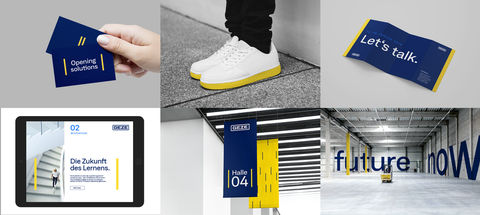
Frames – Opening endless possibilities.
In addition to the design elements such as the logo, colours, font and image style, frames are an important feature of the brand identity awareness. They visualise the aim of offering the customer personal support throughout the project cycle, and opening up new perspectives to them. Frames serve to highlight important messages, act as a call to action and structure the content.
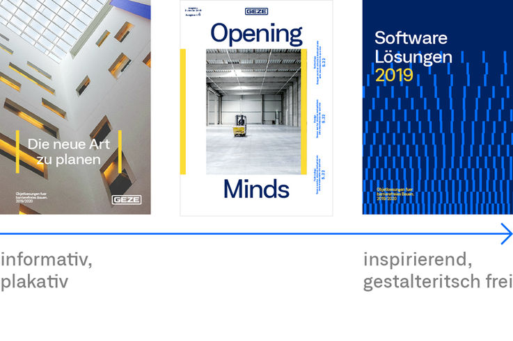
Complete design flexibility
The use of frames ranges from informative and classic to inspiring and creative freedom of layout. This offers a great degree of freedom to depict content of any kind. Frames are in Action Blue and GEZE Yellow. The colour scheme is defined for each application.
