
Eye-catchers
Eye-catchers communicate high-value information as concisely as possible. They often address the user personally and thus increase the willingness to interact. The emphasis is on the main message.
Style
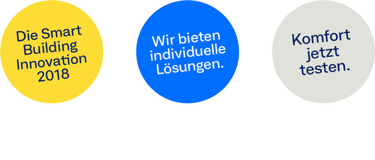
Design
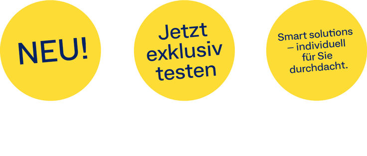
Eye-catcher elements must always be set in a circular form. This shape ensures that they stand out in the straight-lined design. Eye-catchers are always stand-alone and self-supporting. It is not advisable to use several eye-catchers.
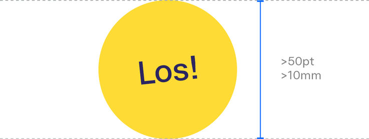
Size
The eye-catchers are flexible in terms of their size, depending on the medium and amount of text. However, it is important to adhere to the minimum size of 10 mm or 50 pixels.

Rotation
To stand out in terms of design and to create a certain sense of dynamics, eye-catchers should always be rotated slightly. The rotation is at least 5 degrees, maximum 15 degrees.
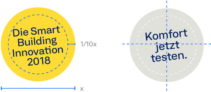
Protected area
The protected area of the eye-catcher is 1/10 of the diameter starting from the edge. The text field is always centred in the eye-catcher.
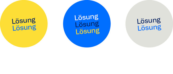
Colour scheme
The colour scheme of the eye-catcher depends on the particular layout. Eye-catchers can be in GEZE Yellow, Accent Blue or Sand Grey and should achieve maximum contrast in the medium. The font colour can be selected individually, taking into account the contrast with the background colour.
Typography
The general rules of typography also apply to eye-catchers. You can choose your own font size according to the amount of text. However, the legibility and the protected area must be taken into account. Text in eye-catchers must be as concise and brief as possible.
Positioning
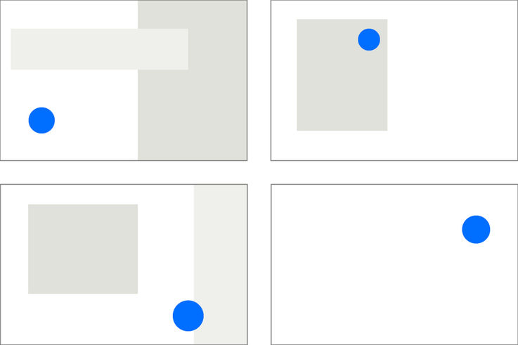
Flexibility in all media
The positioning of the eye-catcher is designed to create maximum presence in the layout. An eye-catcher can be set within a layout.